
With the cost-of-living crisis reducing people’s disposable income, it is more important than ever for charities to have efficient, high-converting websites and online donation journeys.
This guide will cover the importance of landing pages for charities, the key factors to consider when creating them, and how to optimise donation forms to help your charity convert users into advocates and supporters.
Optimising landing pages
What is a landing page?
A landing page is a web page designed specifically for users who land on your website. They have a single focus and goal (call to action) for the user.
Useful A/B tests:
We have compiled a list of fundamental elements you can start to A/B test to help the performance of your landing pages.
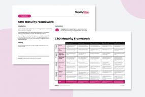
You can follow our CRO checklist to find out how to conduct A/B tests on your website to help increase donations.
- Headline and subheadings:
Ensure the headline captures attention and has an emotive element. Test different headlines to see if they significantly impact primary metrics - Sharing benefits /reasons to donate:
Charity donors want to understand why their donation is important and how a donation amount makes a difference. A/B test different reasons to donate on the landing page and humanise the content - Clear call to action:
The main goal of a charity landing page will be donations. Therefore, leading with a clear, upfront call to action with a donation form above the fold is important. A/B test having the form upfront above the fold on the landing page along with different variations of CTA copy. - Credibility:
It is important that the landing page displays credibility, whether this is in the form of imagery, branding, or social proof.Consider A/B testing credibility techniques, such as displaying the number of donations received this year.
- Powerful lead image:
A/B test different powerful lead images so visitors feel emotionally connected.Get to understand what images work and which ones work for different types of landing pages and different donation strategies.

Form optimisation techniques
The donation form on a charity website needs to be intuitive, transparent, simplistic, and frictionless. Otherwise, visitors will find it difficult to donate and will abandon the donation process.
You can A/B test your donation form/s to ensure you meet user needs at every step of the journey.
How to improve your donation form:
- Pre-defined donation amounts:
Display upfront donation amounts and information on the benefit this amount will help the charity. This helps reduce decision paralysis by a few upfront options - Donation prompts:
Using donation prompts and nudges can help prospective donors understand how the donation amount makes a difference. This relates to altruism and impacting the desire to make a difference - Progressive disclosure of fields:
Users want simplicity and reduced cognitive load. Progressive disclosure of fields reduces users being overwhelmed with too much information so they can concentrate on one task at a time - Clear error messaging and field labelling:
Error messaging and field labelling techniques to reduce form friction - A/B testing different form field layouts such as tooltips, error messaging and field validation will all help decrease user friction and anxiety
- Payment security icons:
Reducing anxiety is a key lever to reducing form drop-out and this can be achieved by A/B testing and added security in donation forms. Security icons at payment can help optimise the donation journey and reduce drop-off at payment
- Mobile first:
Ensure your donation forms are mobile-optimised to reduce friction from mobile users. Ensure form fields are easy to navigate and click with clear CTAs, accessible dropdowns, and single-column layout design
Optimising your landing pages and donation forms for supporters and beneficiaries is an ongoing task. With small, continual changes and improvements, you can maximize conversions on your website, such as donations and newsletter sign-ups.


